
youngs / y
2025
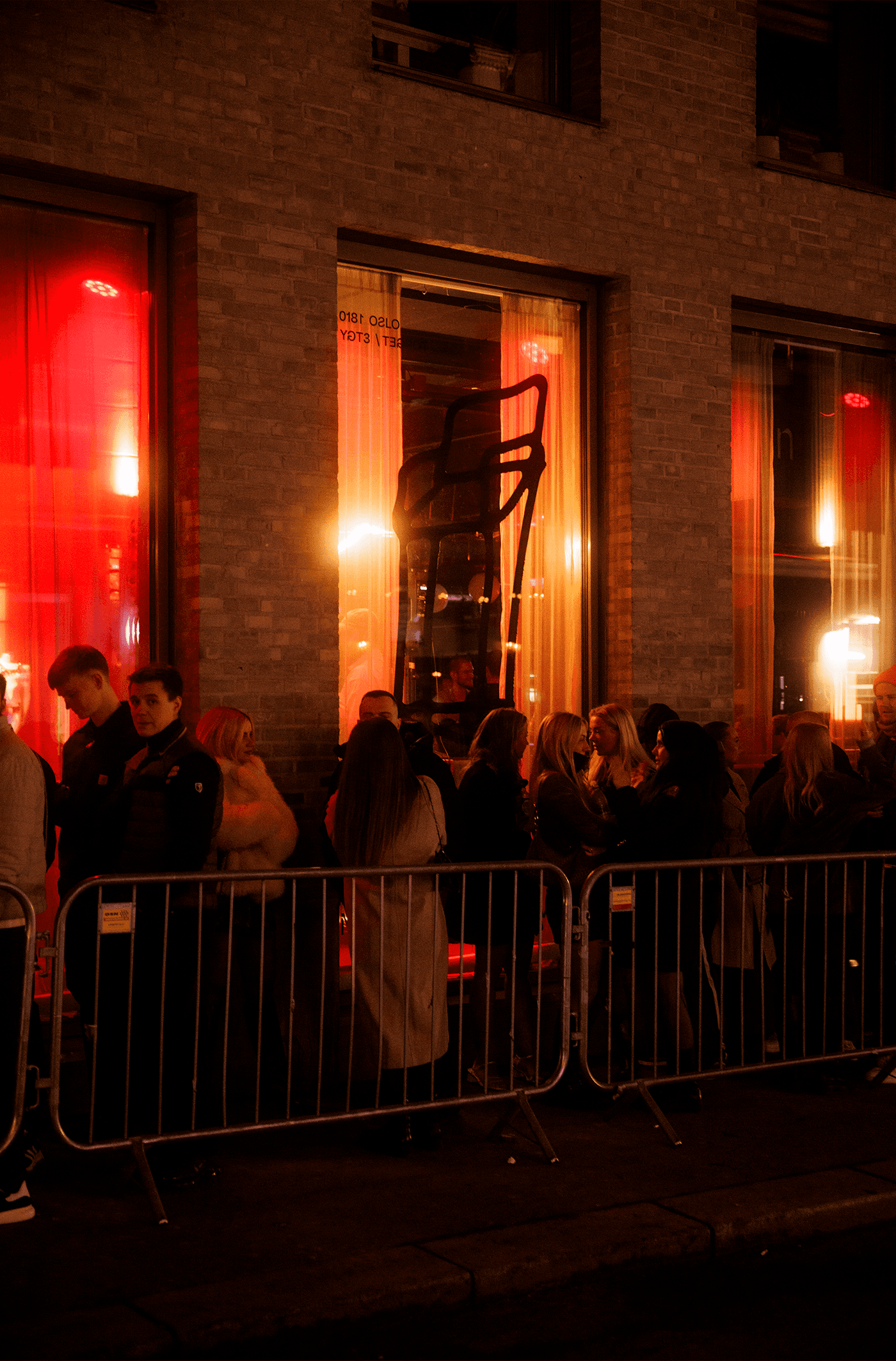
In 2025, Youngs reworked what it could to redefine its place in Oslo's nightlife. It had drifted from what it was meant to be, settling into a fairly generic nightclub with a crowd skewing very young, early 20s. Shifting that wasn't easy, but it needed to happen.
As one of the biggest venues in the city, the goal was an identity that could speak to a wider, 20+ crowd without falling into the usual nightlife tropes. We looked instead to international club culture, with DJs at the center of it. That showed up in details like Japanese street food with a bit more polish, served until midnight, and in how we treated the name itself. A lot of people had already mentally written Youngs off, so letting the name live in a bit of a grey zone worked in its favor. Unable to change it, we let it live as just the letter "Y," carrying the identity visually. That shift also helped bring in more concert organizers and a wider range of events beyond nightlife.
Resident DJs got their own photo series, shot in a consistent style, so the lineup itself became part of the identity.
I worked across the project as part of a small team: identity direction, art direction, campaign concepts, and content.